Media & flex objects
Bootstrap 5 dropped the old .media component—this page shows the modern replacement: d-flex, gap-*, align-self-*, and composition with .card / .list-group. Surfaces use semantic tokens (text-body-secondary, bg-body-tertiary) so the navbar light/dark toggle stays coherent.
Beyond the basics
Official docs cover a thin slice; product UIs need feeds, threads, file rows, KPI chips, and responsive stacking. Prefer gap-3 over ad-hoc margins when both axes matter, and keep the figure (avatar, icon, thumb) flex-shrink-0 so copy does not crush it.
Fundamentals — start / end / gap
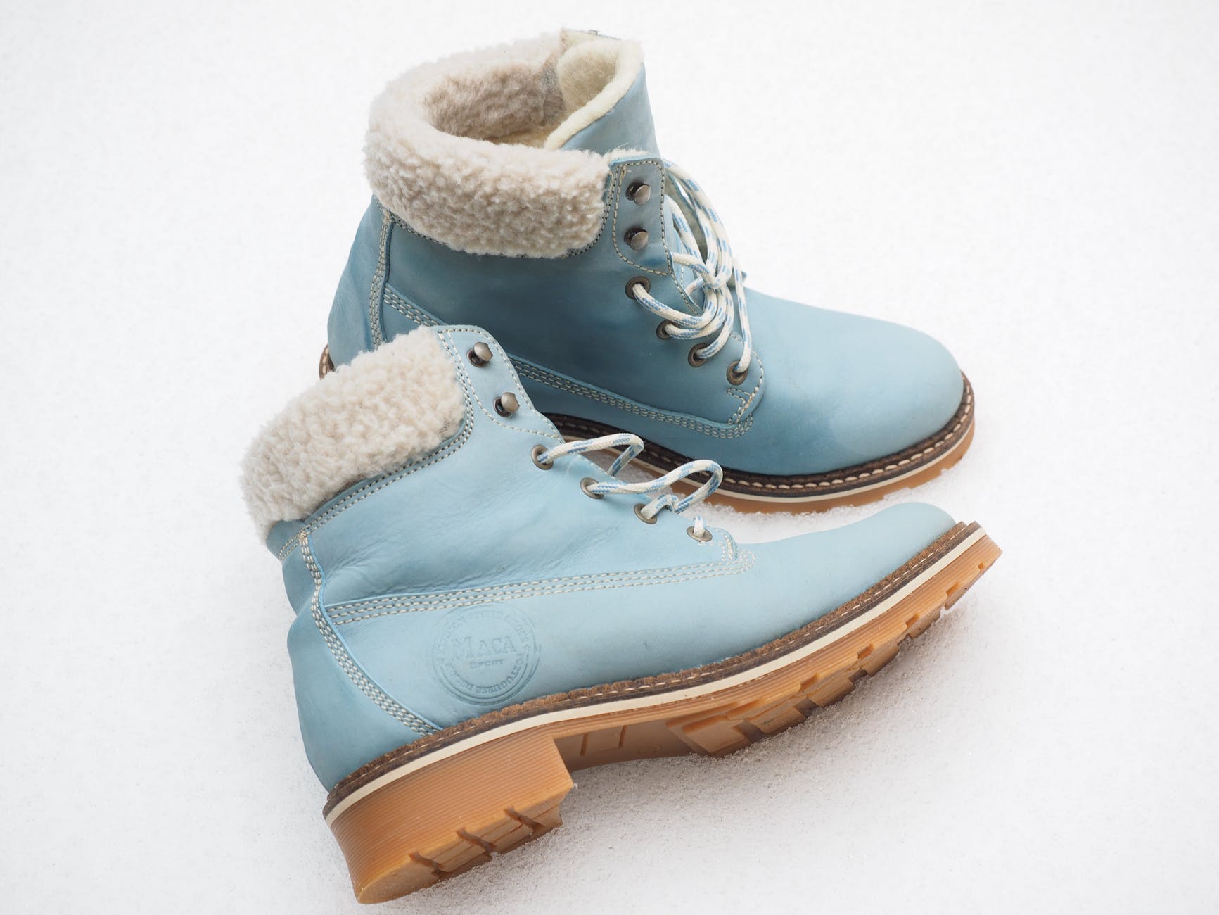
Media left: d-flex align-items-start gap-3 with flex-grow-1 on the body.
Jordan Lee
ProductCras sit amet nibh libero, in gravida nulla. Nulla vel metus scelerisque ante sollicitudin. Fusce condimentum nunc ac nisi vulputate fringilla.
Media right: same flex row with image after body, or order-md-2 on the figure.
Release notes
Donec sed odio dui. Nullam quis risus eget urna mollis ornare vel eu leo. Cum sociis natoque penatibus et magnis dis parturient montes.
Vertical alignment on the figure
align-self-start | center | end | stretch on the image or icon column.
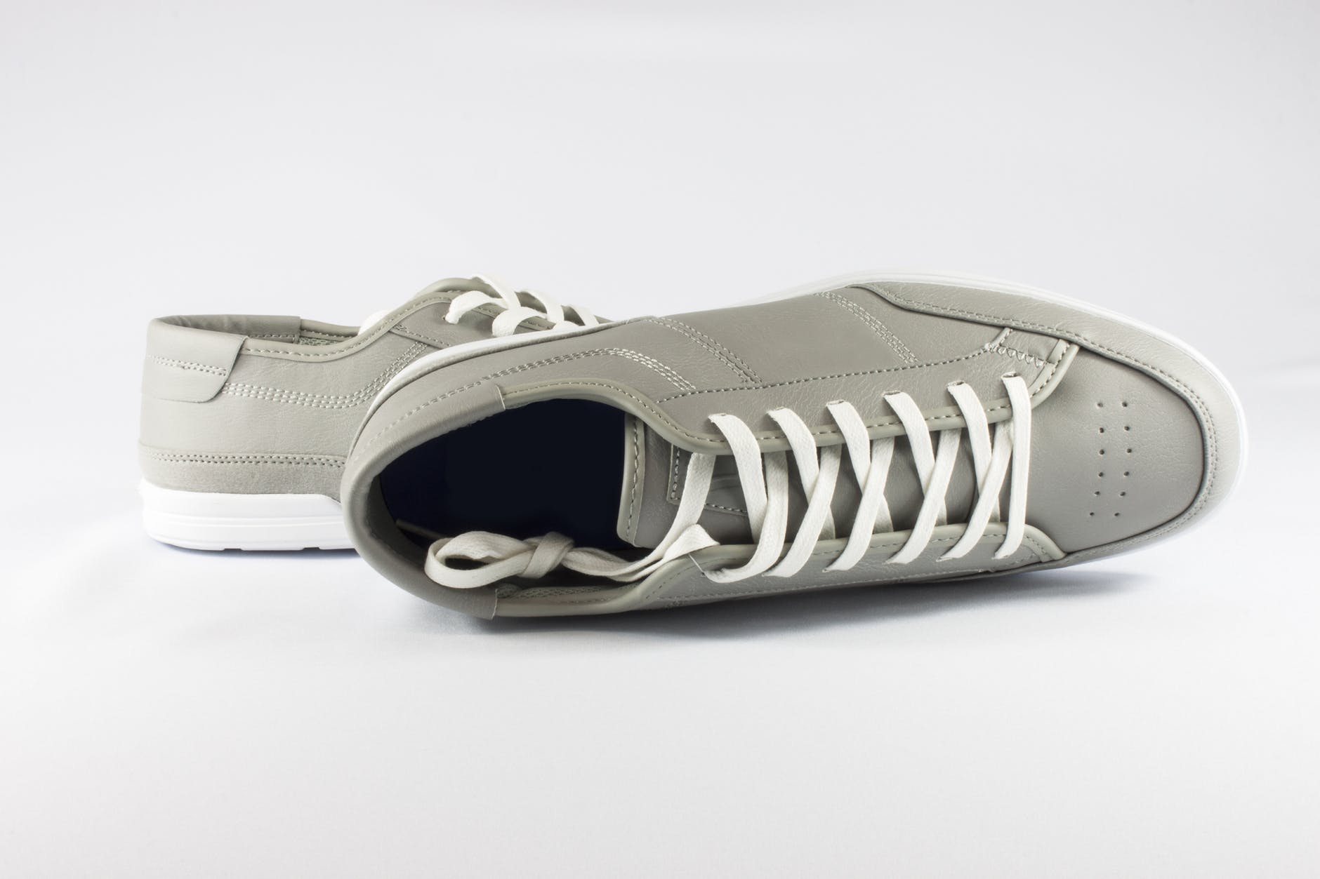
Top-aligned when the text block grows across multiple lines. Useful for comment threads.
Second paragraph extends the column height.
Centers the thumbnail relative to the full text block—common in compact settings rows.
Extra lines demonstrate vertical balance.
Bottom-aligned figure; pairs well with a trailing timestamp or status under the copy.
More copy to grow the column.
Nesting
Nest another d-flex inside the body for replies—keep indentation with ps-3 or a thread line (below).
Parent comment
Cras purus odio, vestibulum in vulputate at, tempus viverra turpis.
Nested reply
Donec lacinia congue felis in faucibus. Use a subtle border for hierarchy instead of deep margins.
Responsive stack → row
Flex column on small screens
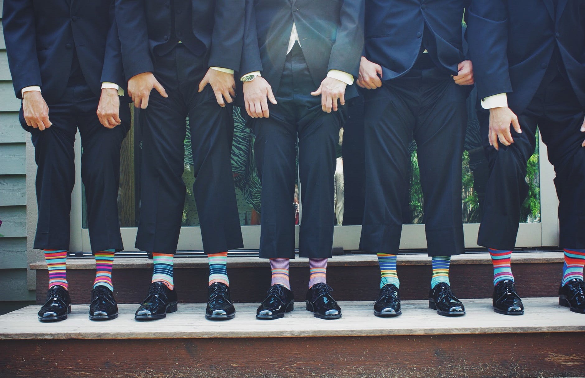
Below the md breakpoint the image stacks above copy via the grid; from md up it becomes a horizontal media object without custom CSS.
Avatar scale & rings
Icon tiles & initials
System event
No photo—use a colored tile for machine-generated rows.
Success state
Soft tint surfaces read well in dark mode with semantic hues.
Initials avatar
Pair with aria-label on the tile for screen readers.
Activity feed
-
You shipped v2.4.0
Changelog published · 12 commits
-
Design review
Mobile navigation patterns approved.
Figma UI -
Quota warning
API usage at 84% for the billing period.
List-group rows
Horizontal cards
Stacks on xs
Row direction flips at sm for thumbnail-on-left desktop layout.
Accent rail & voting
Proposal: dark-mode tokens for maps
Community thread layout: rail + flexible body + meta row.
Colored surfaces
Use .text-bg-primary for full-bleed chips.
Contrasts automatically in dark theme via Bootstrap tokens.
Pair with .text-dark on warning backgrounds.
Media + progress
Milestone row: figure + label row + thin progress.
Thread with connector
Starting a thread on accessibility for media rows.
Use min-w-0 on flex children to allow truncation.
Thread line class is scoped in styles.css for dark mode hue.
Testimonial block
“We replaced every legacy media object with flex utilities—spacing is predictable and the dark theme did not need a second stylesheet.”
Glass strip on media
Live session · 14:00 UTC
Frosted panel uses body RGBA + blur; works on light and dark roots.
Alert-style broadcast
APIs will be read-only on Sunday 02:00–04:00 UTC. Status page will update automatically.
Stretch, order, list legacy
align-items-stretch + full-height image column.
Equal height columns
Image stretches with the text block without a fixed ratio.
Legacy list markup (still valid): list-unstyled + repeated flex rows.
-
List row A
Same as the original Elementer samples, with spacing tokens.
-
List row B
Nulla vel metus scelerisque ante sollicitudin.
-
List row C
Cras purus odio, vestibulum in vulputate at.