Images & figures
Bootstrap 5.3 .img-fluid, .ratio, object-fit utilities, figures, and card media — tuned for data-bs-theme so borders, captions, cards, and chrome read clearly in light and dark mode.
Responsive first
Always set meaningful alt text. Pair wide hero shots with img-fluid and fixed aspect boxes with object-fit-cover or object-fit-contain so art direction survives every breakpoint. Elementer extras live under .images-page-bs5 in styles.css.
Fluid width
Responsive images
.img-fluid applies max-width: 100%; height: auto; so photos scale down inside columns without overflowing.
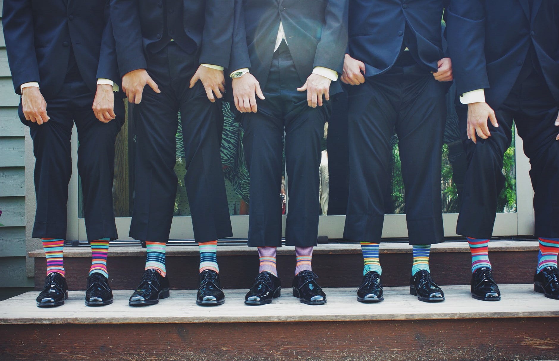
.container / .row grids or cards. For above-the-fold heroes, omit loading="lazy" or set fetchpriority="high" on the LCP image.Corners & masks
Radii and circles
Bootstrap radius utilities (.rounded, .rounded-4, .rounded-circle, .rounded-pill) plus soft shadows.
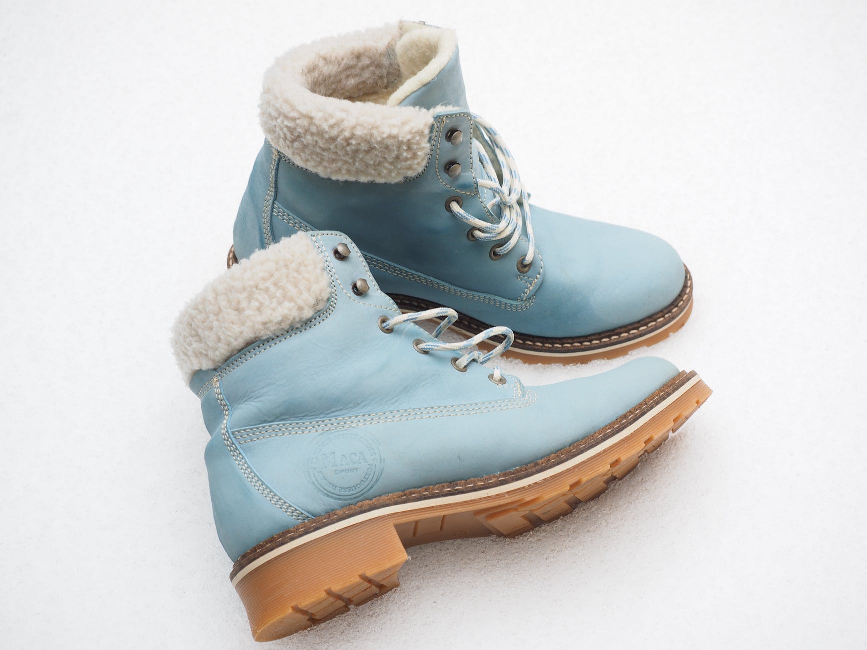 Default
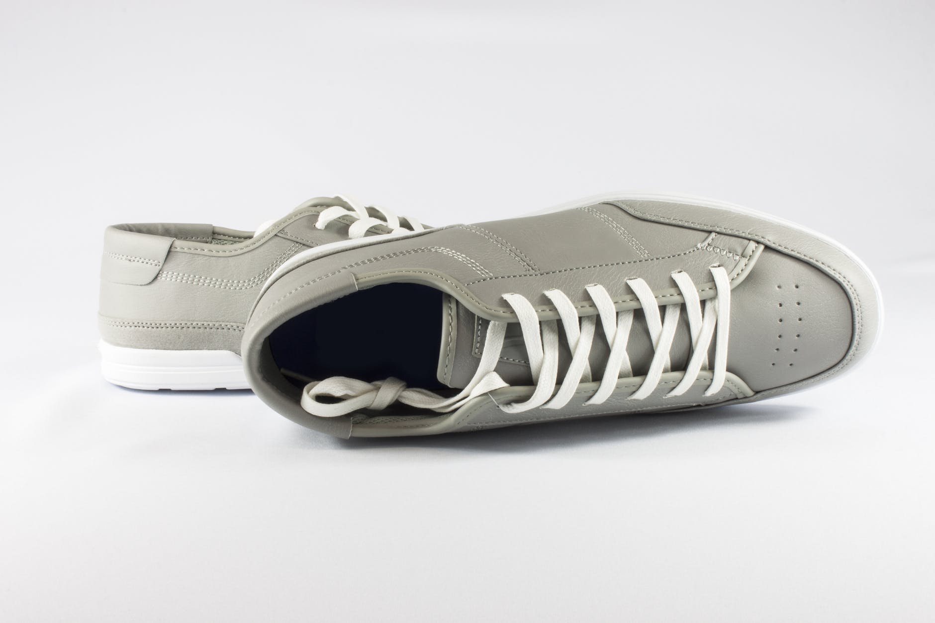
.rounded-3
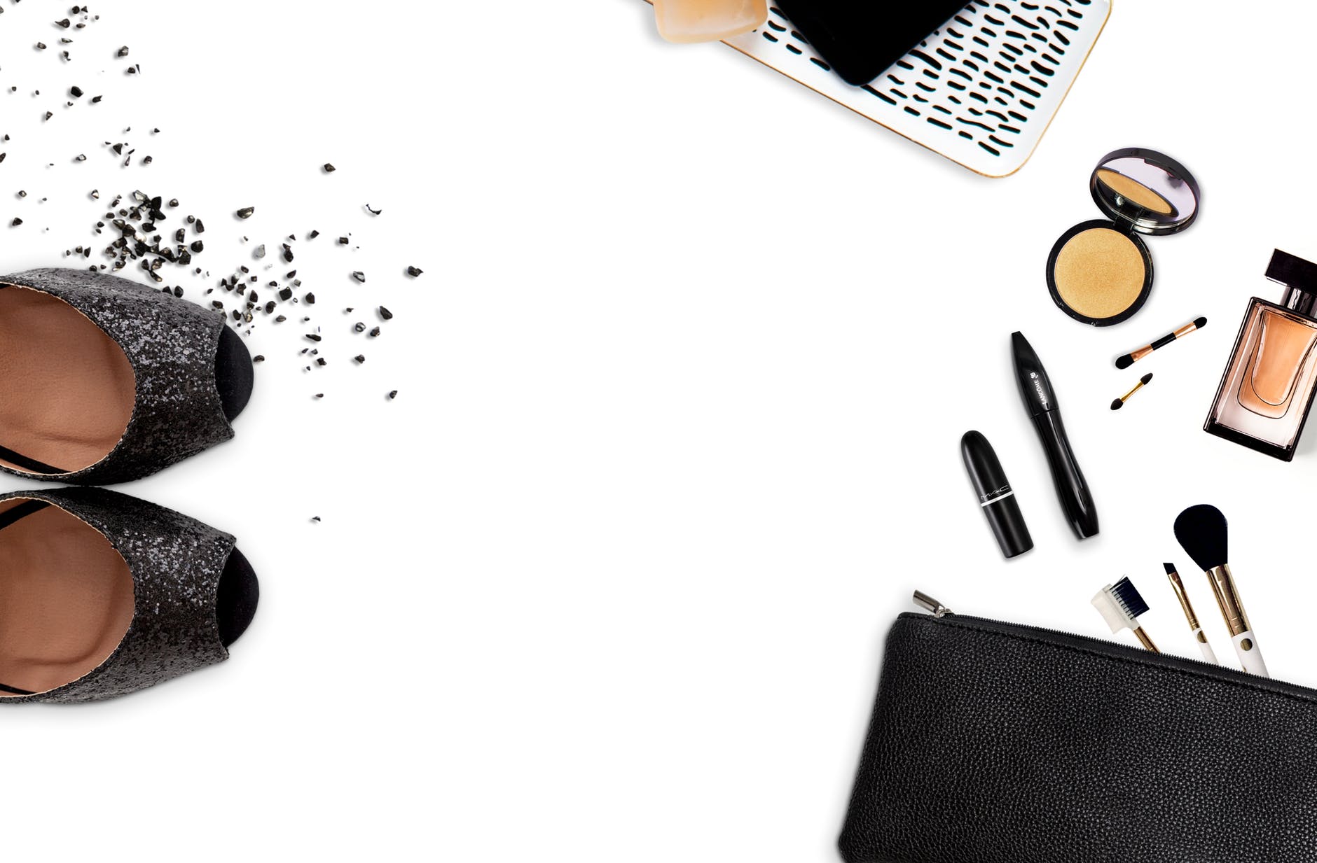
.rounded-circle
.rounded-top-4
Thumbnails
Framed previews
.img-thumbnail picks up --bs-border-color and body background for theme parity.
Borders & rings
Outline emphasis
.border, .border-3, .border-primary, and gradient “ring” wrapper.
Aspect ratios
.ratio helpers
Lock aspect with .ratio-1x1, .ratio-4x3, .ratio-16x9. Scoped CSS uses object-fit: cover on nested images.
1×1
4×3
16×9
Object fit
Cover vs contain
Fixed-height boxes with object-fit-cover (fill, crop) or object-fit-contain (letterbox inside the frame).
object-fit-cover
object-fit-contain
Semantics
Figures & captions
figure + figcaption with .figure-caption; color follows --bs-secondary-color.
.text-md-end
Card · top
Hover zoom
Image scales slightly on hover; container uses overflow: hidden.
Horizontal layout
Media + copy row
Use .row.g-0 with object-fit-cover and a minimum height so the image column stays tall on mobile.
Diagonal ribbon · portrait ratio via --bs-aspect-ratio: 125% (4∶5)
Glass tile
Gradient overlay + caption block.
Grayscale → color on hover
Avatar stack
Fixed dark strip
Images on charcoal
Light borders and muted captions for contrast that does not depend on document theme.
Fixed light strip
Images on pale panel
Panel background shifts in dark mode so the example stays realistic.
Gallery grid
Responsive columns
row-cols-2 row-cols-md-3 row-cols-xl-4 with uniform ratios for a simple gallery.
Picture element
Art direction (markup pattern)
Swap assets by breakpoint with <picture> and <source media="(min-width: …)">. Below, the same file is repeated for demo — replace srcset with real widths.